Visual design
Jan 2020 - May 2021

As the lead designer on the Vuse account at Mirum, I worked across website and lifecycle marketing touchpoints for the GCC region. My role focused on translating a bold, high-energy brand into cohesive digital experiences, while navigating cultural nuances across multiple markets.
Newsletters
Bringing energy into inboxes
Vuse’s social media presence was vibrant, colorful, and expressive. Their newsletters, however, felt templated and flat — disconnected from the brand’s personality.
The goal was to redesign bi-weekly campaigns announcing:
New flavour drops
Device color launches
Bundle offers
Subscription updates
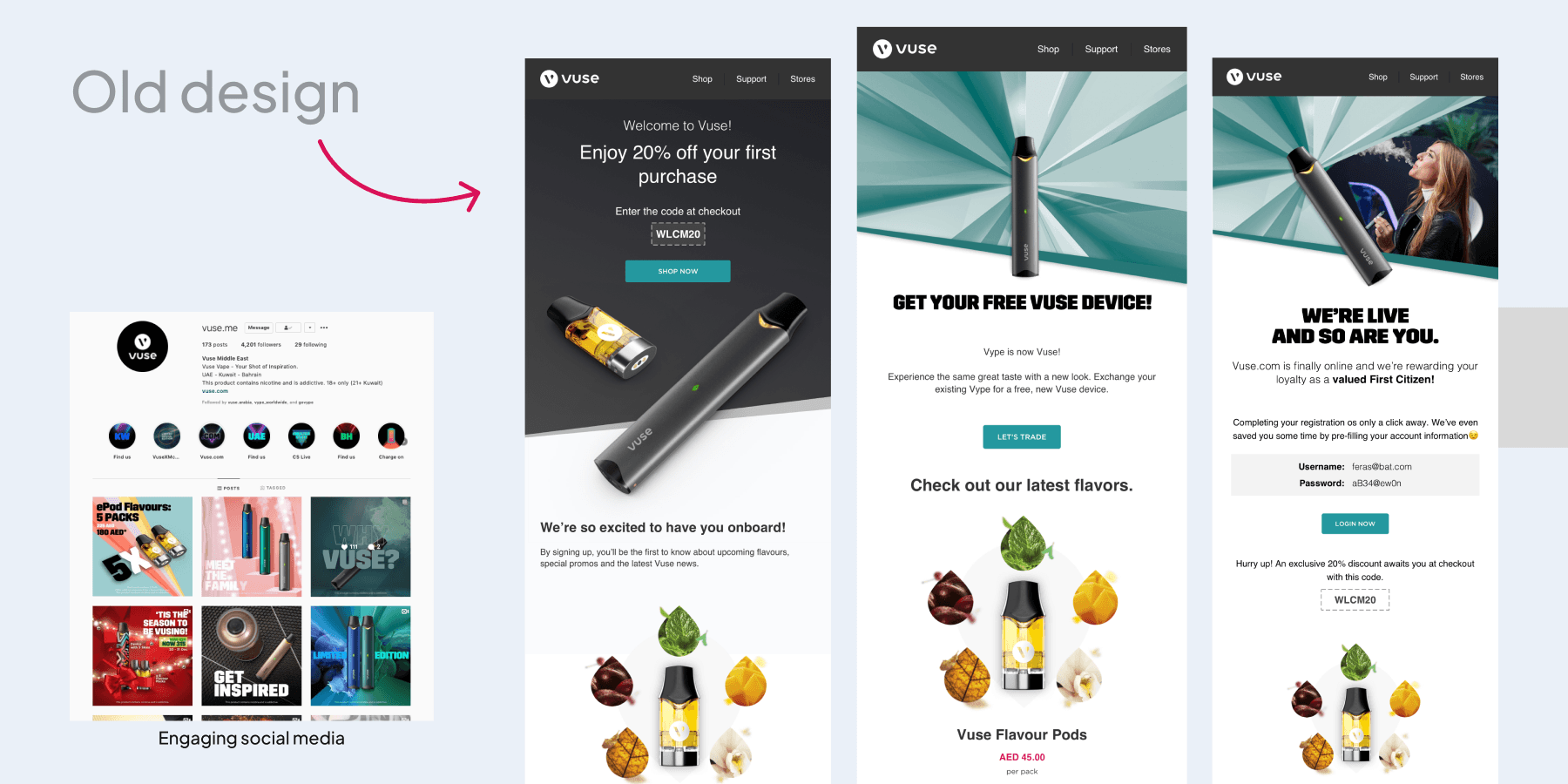
The Challenge
Designing for the GCC meant creating one unified version across UAE, Saudi, Kuwait, and Bahrain.
The client rejected visuals featuring women vaping (both non-hijabi and hijabi representations posed cultural concerns). Showing only men felt unbalanced.
So instead of centering people, I centered the product.
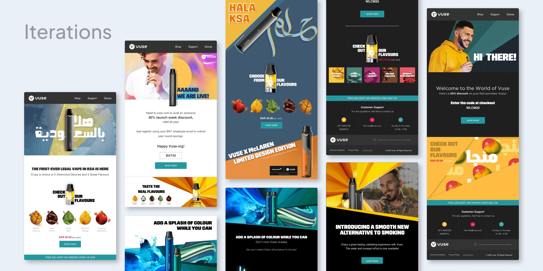
Approach
Shifted focus to bold product-centric compositions
Used dynamic gradients and lighting to reflect flavour profiles
Designed modular layouts so each campaign felt fresh without rebuilding structure
Built a reusable component system for flavour drops and bundle formats
Iterated extensively between dark and light themes
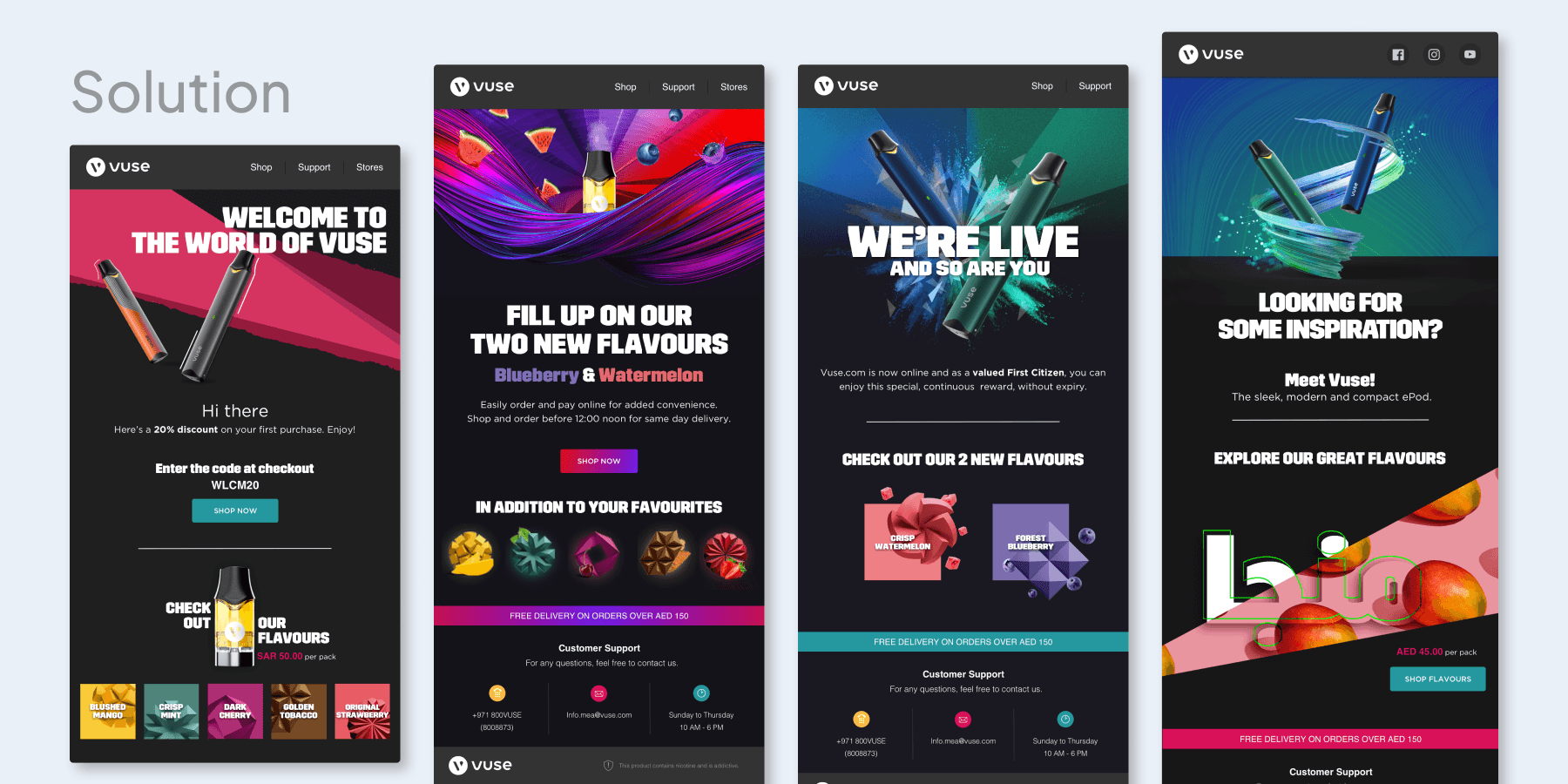
The result was a newsletter system that felt energetic, brand-aligned, and culturally adaptable without compromising visual intensity.
Website Redesign
Translating vibrancy into commerce
Redesign shopping flows and key pages including navigation, customization, bundles, and the newly introduced subscription feature.
The existing experience leaned heavily minimal. The ambition was to retain clarity while injecting brand energy.
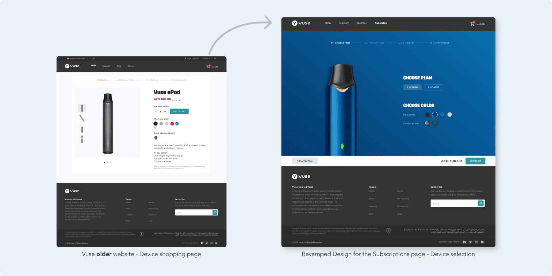
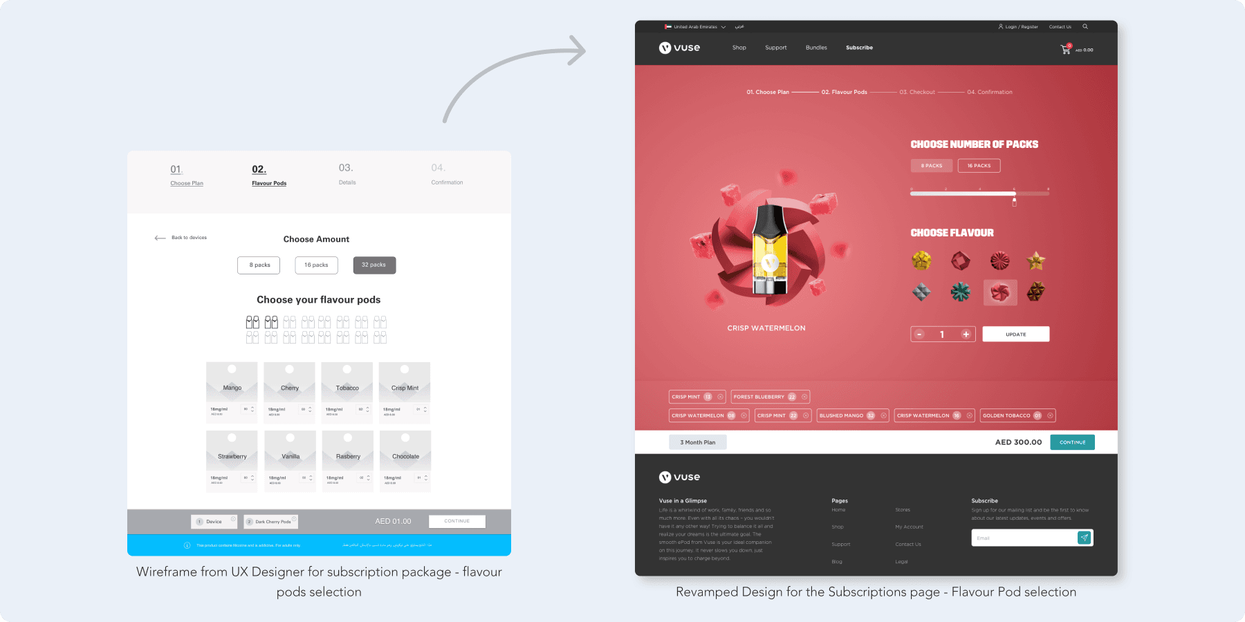
Dynamic color-shifting interface
Instead of static white backgrounds, pages incorporated color transitions tied to flavour families and device variants making exploration feel immersive rather than transactional.
Templated product architecture
I designed reusable layout systems so:
- Each flavour page followed a consistent structure
- Bundles could be easily assembled visually
- Subscription messaging remained prominent